In this post, I would like to focus, on the critical evolution of my website.
·
Planning
stage:
My website has got a tagline ‘Magdalena
Surowiecka Photography’. In the beginning, my idea was to create a website
that will be more subdued colors but after all, I decided on white with
pink font. I plan to change a few things as now I see it is not refined. My page
‘About me’ need more information regards my person and my passion which is
photography. Also on the main page, I would like to add more pictures as the amount
right now is poor.
·
Research
I try to take an example, especially from my
favorite photographer – Russ Jackson. Now his website is differently designed but
before he also had subdued colors. The page of Russ was so clear and there
was an easy way to find what you wanted to find. I think, due to his experience
and for sure this is not his first website his page is more simple but more elegant
than mine.
To also have an easier way to help find what
people need I wanted to create 4 pages for my site, and this is what I have
done.
·
Content
My website content is mostly kids. Children
are the models which I focused especially to make photographs. Due to this, my
potential customers can be a company which will want to create an advert with
kids involve, parents, or even schools.
In my opinion, possession of a website is
important because of a few reasons:
·
Easier
way for clients to find a photographer
·
Presentation
of my work
·
Possibility
of contact
·
Access
to my official accounts
·
Design
I have used a lot of design elements. First of all, I changed the background of each of my
sites. Then I added a different color of fonts used in navigation. After all, I have added some photos. I think I should start by step in that each
site does not jump from one to another. I was very excited to create my first own
website. I changed these elements to make the website more enjoyable for the eye.
Now I want to change some things, I have created a logo that I would like to
use on my website, and I want to add more photos on the front page and as mentioned
earlier add more information regarding me. The temples which I use for my website are:
·
Main
site – Smoke and Rainbow
·
About
Me – The Flamingos
·
Major
Project Gallery – Dramatic Staker
·
Contact
Me – Flamingos
I choose
these temples because I like them very much flaming. They are so beautiful and
make a smile on my face. Also, I wanted to connect websites with my vision, kids
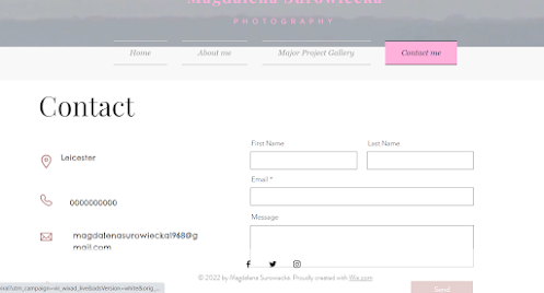
also make people smile. They are so full of likes and make life so colorful. My ‘Contact me’ site works for everything. There are also some links to my official
account, which can also help with the trial to contact me.
·
Navigation
As mentioned before, my website has got links to my official account which is
Facebook, Twitter, and Instagram. The icons are at the bottom of each site, it
is easy to find. Also if someone will want to look for a possibility of contact
with me, my site ‘Contact me’ Is working and it is connected to my e-mail, so
I will have a quick way to replay as well.


No comments:
Post a Comment